
BEFORE YOU TRY THE PRODUCT, YOU SEE THE PACK.
Packaging is often the first conversation between a product and the person picking it up. Before the paper is touched, before the pack is opened and before anyone knows how it performs, there is a visual impression to make. For a small product like rolling paper, that becomes even more interesting. There isn’t a huge surface to work with, which means every choice — from typography to colour and layout — has to earn its place.
“GOOD PACKAGING DOESN’T JUST HOLD THE PRODUCT. IT INTRODUCES IT.”
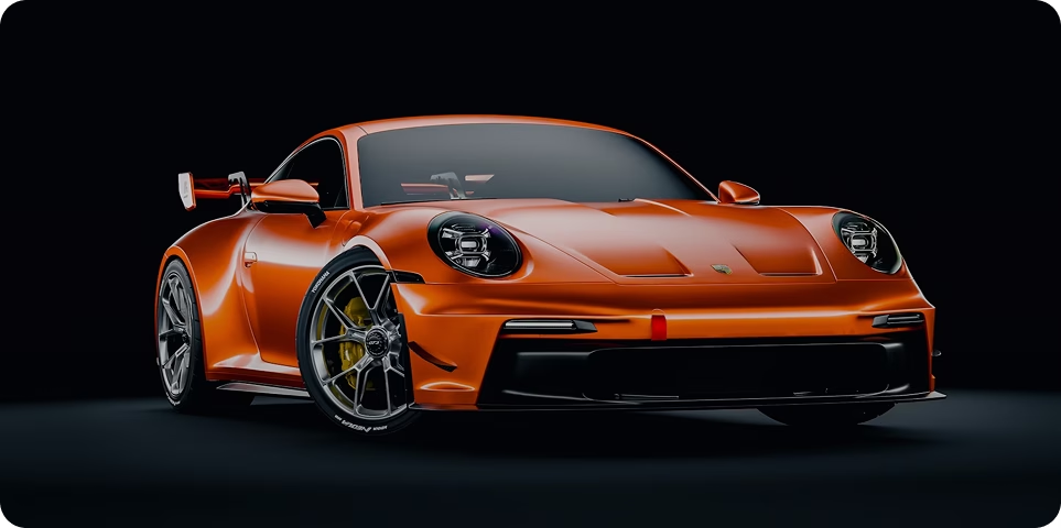
WHEN DESIGN BECOMES IDENTITY.
A recognisable package can make a product easier to remember, but strong packaging isn’t only about standing out. It should communicate something about the brand before a single word is read. The colours, materials, typography and overall visual language work together to create an impression that can become as familiar as the product itself.
- COLOUR CREATES RECOGNITION: A distinctive colour palette can help a pack become recognisable at a glance. Over time, those colours can become closely associated with the brand.
- TYPOGRAPHY SETS THE TONE: The typeface and how the words are arranged can make a product feel minimal, bold, playful or premium without needing to explain it.
- MATERIAL ADDS CHARACTER: The physical feel of packaging contributes to how a product is perceived. Texture, finish and construction can make a simple pack feel considerably more considered.
- CONSISTENCY BUILDS IDENTITY: When the same visual language appears across every product and communication, people begin to recognise the brand without needing to see its name first.
Because sometimes, the first impression is made before the pack is even opened.
